
As the product lead Consultant at Khabri, Akshay planned the product roadmap to improve the retentions numbers and engagement time.
As the product designer, Rajan created new user experience and user interface for the vernacular audiences of India.
The onboarding didn’t show what the app was used for. It lacked emotions, positioning and the right narrative to encourage users to sign up.
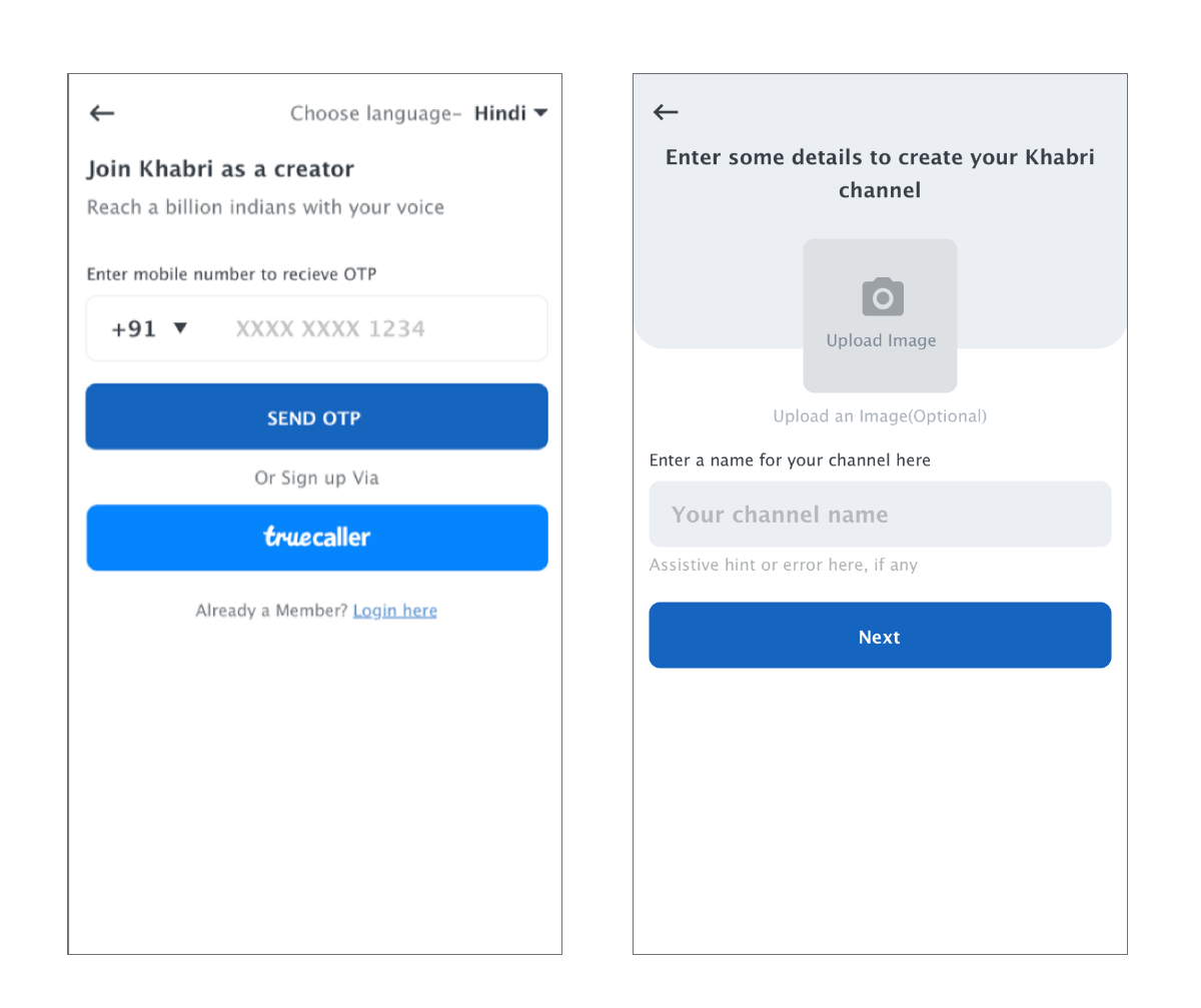
The landing to the creation funnel was observed and various loopholes were identified. It helped us understand why there was a drop in those who initiate creation vs those who post.
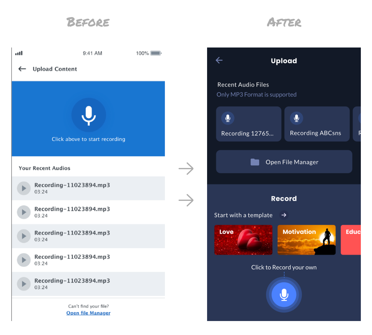
Most of our creators used platforms like YouTube and Facebook, for content creation.
The tool didn’t match their expectations as they were comparing it to what they were used to.
This was observed from various user interviews.
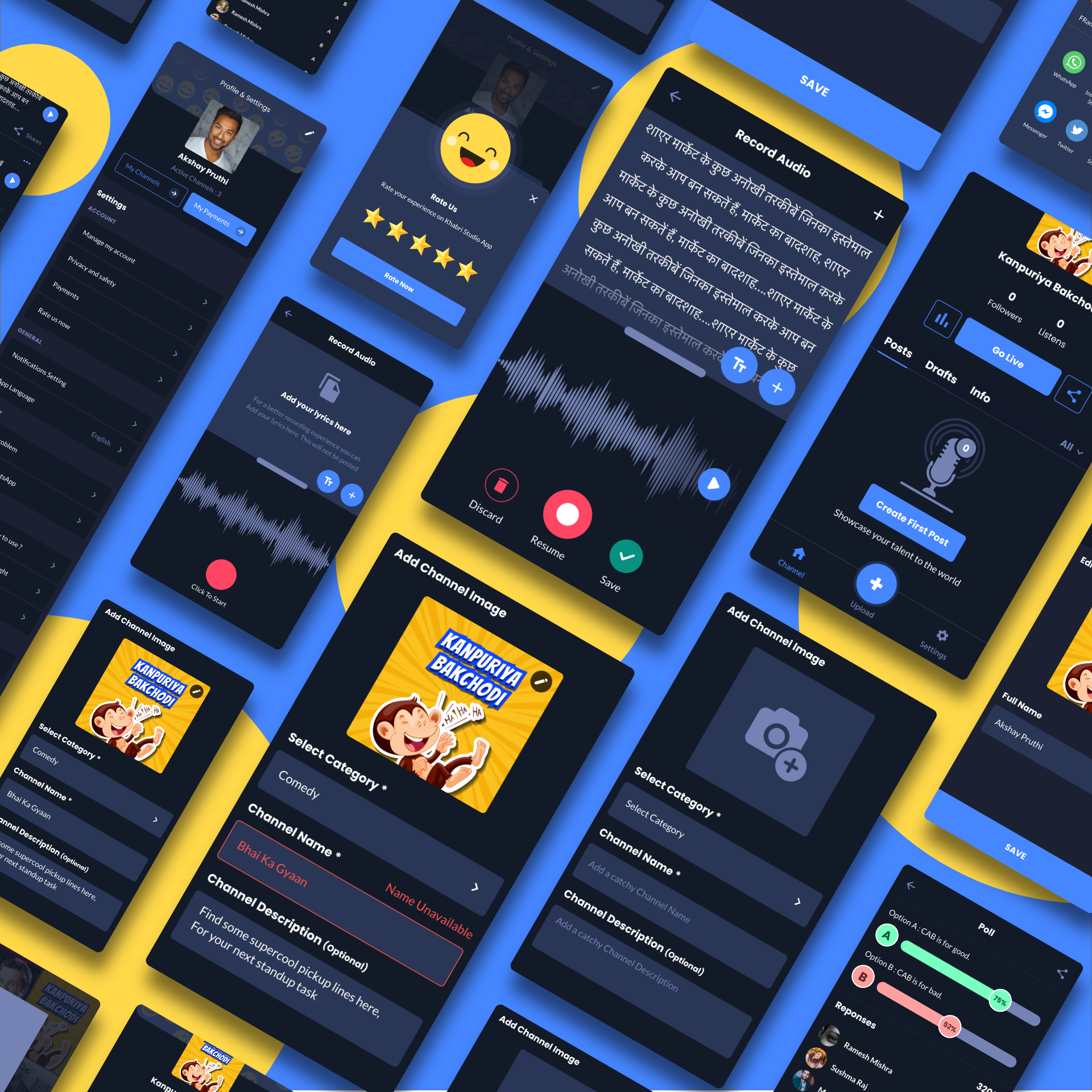
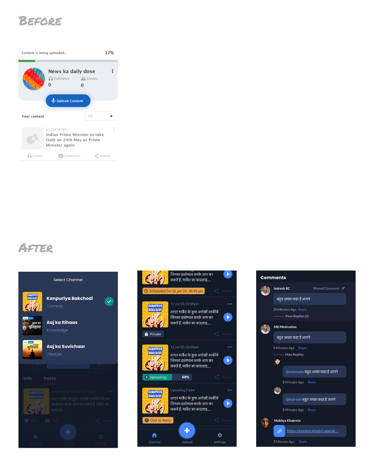
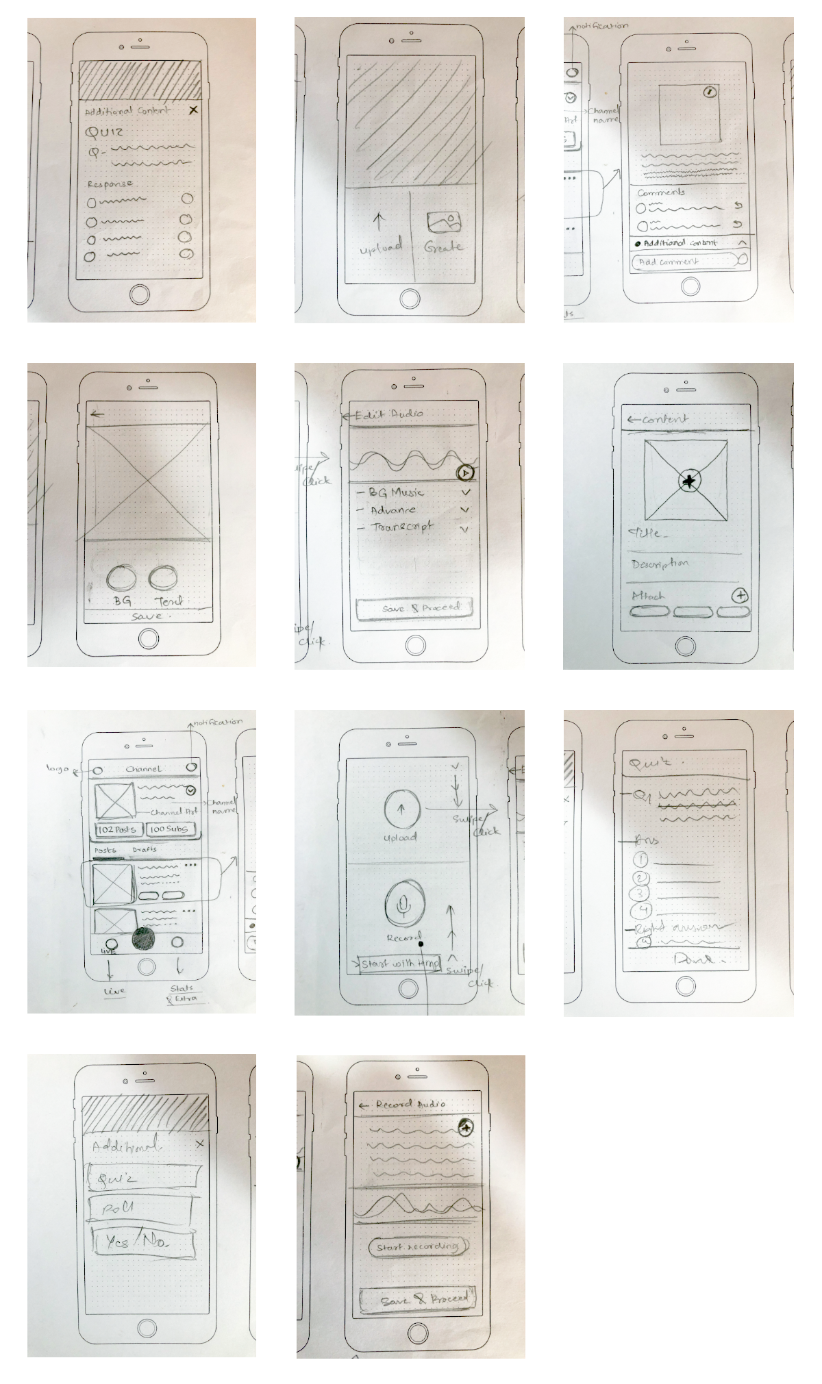
1. Revamp the design with the launch of new utility tools for creators to awe using them
2. Implementing consistency in branding colours.
3. Host on-going interactive sessions with the creators and identify what would help increase the engagement with their subscribers.
1. Going live
2. Creation of content
3. Managing the existing content
A creator can make the content Private or Public. We created a user experience where a creator can easily:
There is a significant number of users who love posting content but aren’t sure what to post.
To trigger those users, we launched a feature where you can preselect the content from the templates provided and voice-over it.
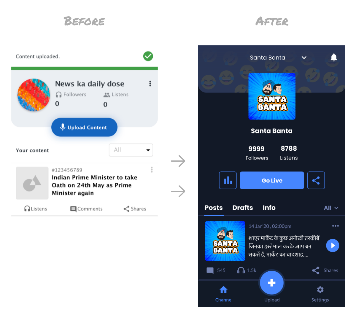
This led to an overall 30% increase in the content creations per day with a higher quality than before.
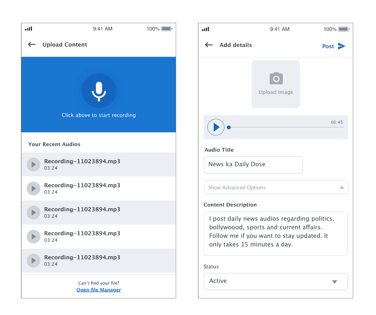
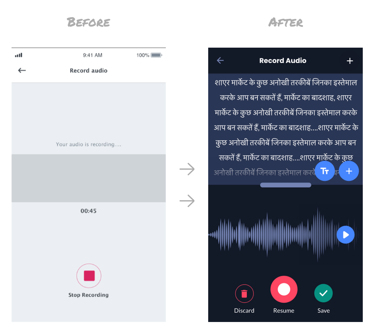
Offline behaviour, that we studied after interacting with almost 100 creators was - Most of the creators first used to write content on their notebooks and then voice it out on the platform.
We digitised the entire experience. With the new designs, the creator could now write the content there itself and record reading the content simultaneously.
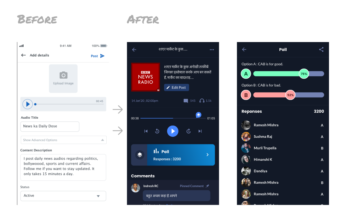
One important observation was a lot of users were coming to the app because they were able to interact with their favourite creators through comments. One key insights from here - If we are able to give creator more tools for them to engage with the users, our KPIs will have a huge impact.
Hence, we introduced polls and quizzes and created a loop where creators announce the results of the poll / quiz the next day. This helped in bringing back the users on a daily basis as they are super interested
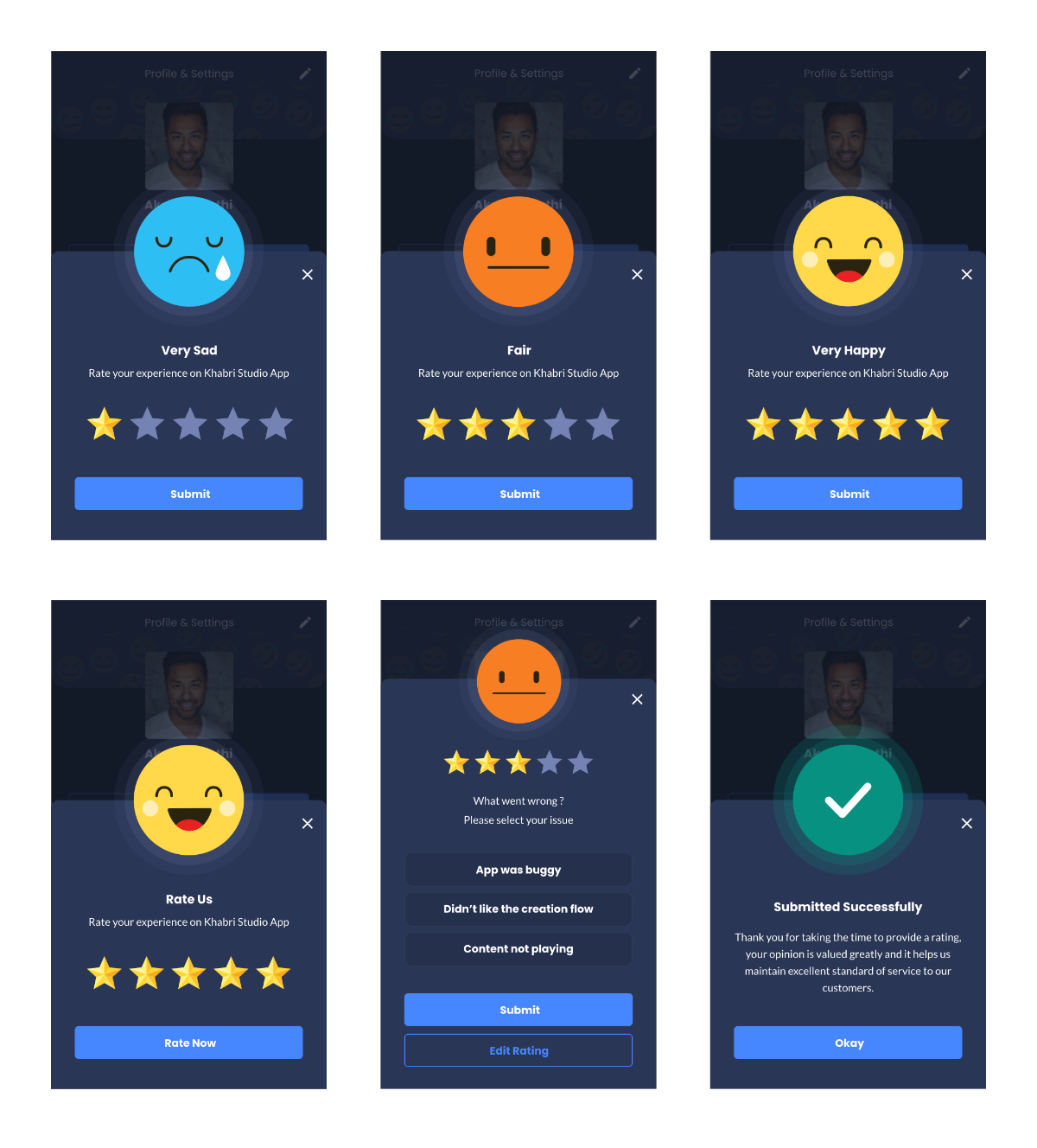
A basic thing that’s often missing in most platforms while users are asked for rating is:
A 60% increase in the UGC.